Showing posts with label color. Show all posts

Wednesday, July 11, 2012

Need an Update??


It seems that the pendulum in design does not swing slightly, but more with a complete and earth shattering paradigm shift.  Here in the Dallas area, we have been entrenched in the Old World design style for many years now, and like all things, it's getting old.  My clients are longing for a lighter and brighter feel to their homes, but  in this economy, few people can start from scratch with all new furniture and accessories.   So how do you change the style of your spaces without "throwing the baby out with the bathwater"?


Google Image

 If your color scheme is filled with dark colors, begin to eliminate one of the strongest colors from your scheme replacing it with the next shade lighter in the same family.  For example, it you’ve used a lot of reds,  start pulling in some lighter shades of terra cotta or peachy tones.  They will still work with the reds, but they are lighter and less intense.   Painting your walls a softer, lighter color is the easiest and least expensive update you can do.

Dan Marty

As you begin to replace furniture pieces around the house, replace the heaviest pieces first.  If replacing furniture is not in your budget just yet, choose to paint some pieces to lighten up their look.  It’s fun to have the juxtaposition of a large scale, heavy piece painted in a glossy white or a bright color, and it brings a different kind of drama to the space.


Debbie Lido

Refreshing heavy window treatments with light and airy panels will do the same things as a good face lift!  Instead of heavy tapestry and formal silk, think linen and lightweight sheers.  We're loving the woven wood blinds too!.  You'll have a radical transformation!


Many of my clients still love the "Traditional" look, but if you  take away some of the “goop” (That’s a design term for fringe, tassels, trim and basically heavy handed decorating), you'll freshen up the space without loosing that comfortable feel.    Most of the time just the process of editing your space will lighten it up.  Begin to incorporate some different colors into the mix so that the space will take on a different feel.  


As you’re working through the process of making changes to your home, don’t leave behind the tried and true principles that make any room work….scale, balance, repetition and color, and it you need some help call in the experts to lay out a plan to get you started.


Sally J. Designs helps you to LOVE your home!

Contact us for in-home and on-line design and decorating services.

Sunday, June 12, 2011

Block it !

Solomon said that "There is nothing new under the sun"......
             And I believe him.


One of the delightful things about growing older is that you are not surprised when a "new" trend looks like something you've already worn or lived with before. So it is with the hottest trend off the runway and in home decor ... color blocking.


Now, I  know this is not new because i grew up in the 60's when Mondrian became a household word.  


Piet Mondrian

We even dressed dolls in Mondrian-inspired clothing!


His influence was seen in home decor as well......Literally!

the Formica Place

But I must say that the reinvention of the color block trend has moved away from the primary color palette and is giving us tons of color inspiration.  

The runway has been showing this trend for a while.


And now it's time for interior design to be creative with color blocking. 

There are some basics for making this work in your  home or you clothes.

Remember the Rule of Odds

It's always recommended that your accessorize in 3's, or at least odd numbers.  The same holds true for mixing colors.  Keeping the color palette to three or five bold colors gives emphasis to the strength of the colors and keeps the room looking focused and well planned. 

Urdu Planet

Flickr

Repeat!
For the color block scheme to really work, you need some repetition of color.  You don't have to repeat every color, but repeat at least one color in your chosen palette.

Creamy Life blog

Jill Sorenson - Marmalade Interiors


Add neutrals.
Black, white, brown, gray are all neutrals that balance out the bright colors that you're using.  Bold colors will always catch the eye in a room, but it's the neutrals that ground all the colorful layers. 

House of Turquoise

via shelterpop

Work with shades
Rooms that work best using color blocking have a least two colors that are close to each other on the color wheel.....reds and oranges, blues and greens...pink and purple....and then they reach across the wheel for that pop of color.

Jane Hess

G Style @ Home


You can use color blocking in a bold way...
Daun Curry

Carey Kaplan

...or in a more subdued and relaxed way.

Jill Sorenson

Pops of color will always energize a space, and although it might be out of your comfort zone to mix unrelated colors, you can start small with a pillow or a lamp base or even a paint color to break the ice.  The days of matching color and pattern all over the room are really over, and it's time to embrace color in a new and more modern way.  

Pull out your inner "hippie" and try on some color!  


Sunday, February 6, 2011

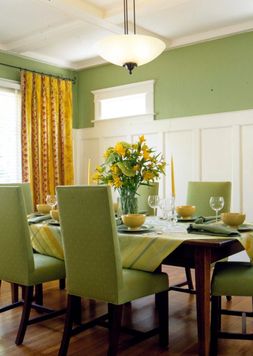
Go Green (and Gold)!

No one would ever accuse me of being a football fan, but I know all the Packer fans are very excited about their win in Superbowl XLV!   In the spirit of the win, "designer style", I'm posting beautiful pictures celebrating the Big Green and gold.


Are you getting on the Green and/or gold bandwagon?


Joclyn Taylor


BH&G


Style at  Home Wallpaper


 Kelley Designs


Tria Giovan in Costal Living

Tobi Fairley


So, what do you think of adding some "cheesehead" to your color scheme this year?

Sally J. Designs can help you to LOVE your home!
Contact the Sally J. Designs team 
for personal and on-line design and decorating services.

Technorati Tags: ,,,

Wednesday, November 17, 2010

Friday, November 5, 2010

Return to Love….uh…I mean….Color

I was catching up on Facebook this morning, and my friend and fellow designer, Wanda Horton, posted an article that caught my eye.

The title “Neutrals are Out….Bold Colors are In” was like the angles descending and the heavens opening up!

I’ve been waiting for this day!!  (Not that I’ve ever hitched my train to the neutral bandwagon).

restoration hardware

Restoration Hardware catalog
How do you stay awake in this room??

My theory is that these mass marketers (who make all their furniture and accessories overseas somewhere), have discovered that if they don’t give you any options and keep everything neutral, then they make more money!

I have nothing against making money, but just don’t try to convince me it’s good design!

While this room, and many others in a neutral theme, do incorporate the elements and principles of good design otherwise, leaving out color is like eliminating salt from frenchfries or eating oatmeal for every meal !

So I was elated to read that “They” have decided that color is back…..like it ever really left!

Isn’t this just more fun?
house and home  photo simon kenny
House and Home – Simon Kenny, Photographer

Doesn’t this stir the senses a little more?
Martha Stewart
Martha Stewart

Even when color is subdued, it can be interesting.
photo Tracy Shumate
Photo – Tracy Shumate

Doesn’t this just make you happy?
I Elaine Griffin for Home Goods
Elaine Griffin for Home Goods

In reality, there aren’t bad colors….neutrals aren’t bad either. 
They are necessary to ground a space, but I’m  just grateful to see a little more life in my color palette.


What say you?  Team neutral or Team color?

Sally J. Designs helps you to LOVE your home!
Contact the team at Sally J. Designs for personal and on-line consultations.


Friday, August 27, 2010

In the Pink

I'm thinking pink today.

It was my favorite color when I was growing up, and I don't think I've ever grown out of my Pink-Love.

But just like me, pink is all grown up. 


Jonathan Adler

Country Living


The fabric houses have gotten on the pink bandwagon as well.
Here's a few of my favs.
                
Lee Jofa, Jane Churchill, Highland Court, Duralee


Duralee, Manuel Canovas, Schumacher, LeeJofa

There's often something whimsical about Pink, and that usually brings me to a happy place....not a bad place to be!


Canadian House and Home

seen on Life in Pictures blog


Betsy Johnson for the Valentine House

Otthan magazine (Hungary)

I like Pink when it's unexpected....which is most times...

Laufen.com

I so wish I had the nerve for this!
Seen on Life at 514 blog

It's not just for little girls anymore, although it will always be great for them too.
Caldwell Flake Interiors


Robyn Karp Interior Designer

Whether it's soft or bold, sweet or sassy...It pretty much makes me happy to be around it.
Truthfully, doesn't it do that to you too?

Sigh.....

Decor8